5 Legitimately Awesome WordPress Fonts to Use Right Now
Choosing the best fonts for your website is a good idea.
Fonts have some way of giving off uniqueness to your website (brand recognition) and may even help you stand out from other competitors.
In addition to the design vibe, they are also great for improving the readability of the texts on your website.
If you’re wondering about which WordPress fonts to use right now, here are some of the best ones you can find:
1. Roboto
Roboto is the “font of the future”. You can see it on many modern websites that look gorgeous.
The typeface design is largely geometric, with open curves that look friendly and futuristic. The font size also makes the letters look more natural, which is great for natural reading.
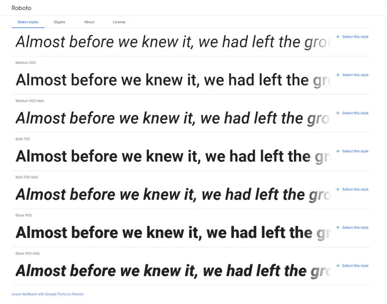
Roboto always looks good — whether you use it on the title or on the body content (though it’s mostly used in the body).
It also pairs great with fonts like:
- Raleway
- Lora
- Rokkit
- Space Mono
- Archivo
- Lora
2. Poppins
Poppins is a popular WordPress font that’s also being used in theaters. Modern websites started using it only recently.
The font itself is geometric and has a clean design. It includes 18 different font weights — with each letterform looking almost monolinear.
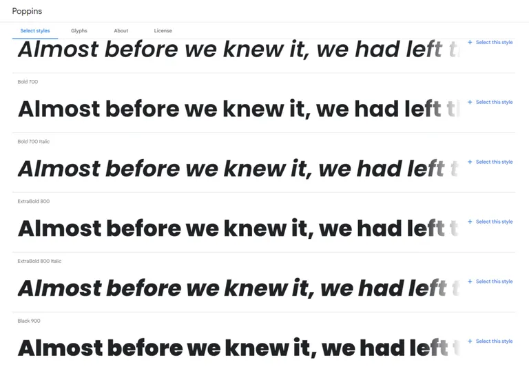
Poppins is best used for headlines — in bold. Using it in its normal form in headlines would make it look a little weak.
It pairs great with fonts like:
- Open Sans
- Droid Serif
- PT Sans
- Playfair Display
- Teko
3. Merriweather
Merriweather is the font that you’re currently seeing now as you’re reading this sentence.
This font was designed to look good on screens. The letters in this font look tall, with slightly condensed forms, accentuated by mild diagonal stress.
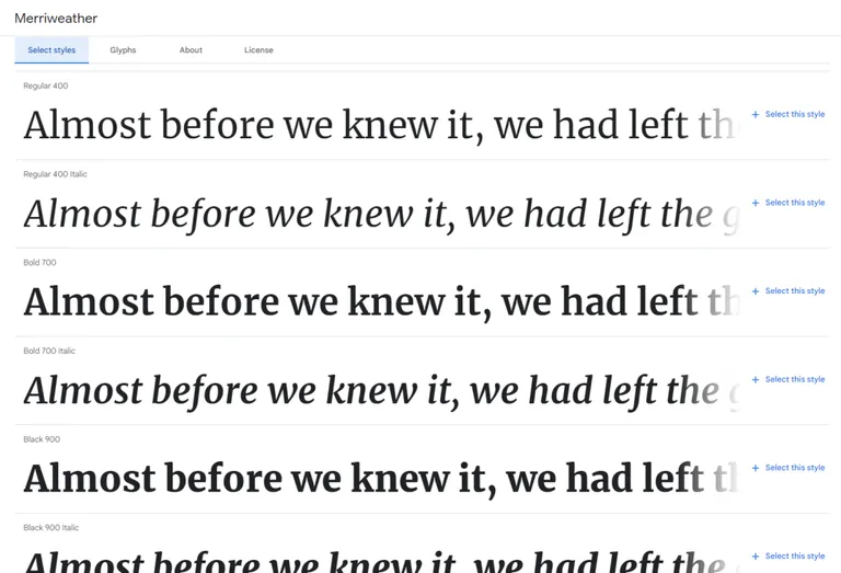
Merriweather looks good in body content — though it also looks good when used in headlines.
It pairs great with fonts like:
- Roboto
- Open Sans
- Replica
- Proxima Nova
- DIN
- Future PT
- Brandon Grotesque
4. Montserrat
It’s almost impossible not to see a text written in Montserrat as it’s a highly popular font that’s being used in almost any type of text.
It’s composed of a geometric sans-serif typeface, recently adjusted so the regular font feels lighter for longer texts. Montserrat is also the official font for the government of Mexico.
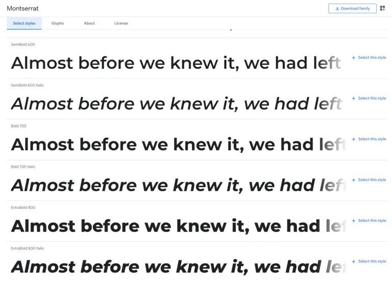
Montserrat is perfect for headlines — giving off an air of professionalism and simplicity at the same time.
It pairs great with fonts like:
- Open Sans
- Lato
- Roboto
- Esteban
- Karla
- Georgia
5. Open Sans
If you like Sans-Serif fonts, then Open Sans is one of the best WordPress fonts you can find.
It’s also a popular font that’s used in many sites, including some from Google. It’s also popular in printed materials.
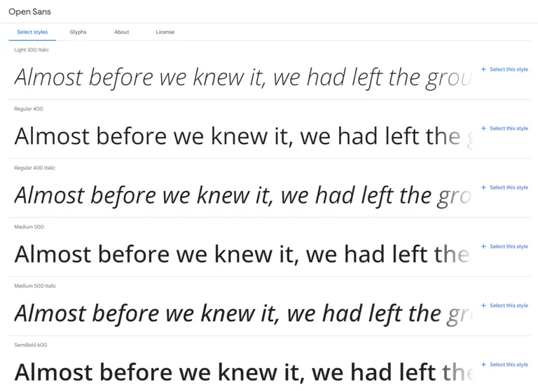
For the design, Open Sans looks clean and simple — making it a good font for almost anything under the sun. It has excellent legibility characteristics for excellent reading even on screen.
It pairs great with fonts like:
- Montserrat
- Bitter
- Domine
- Sans Pro
- Lato
- Roboto
6. Lato
Lato in Polish means “summer”, which fits it perfectly due to it giving a feeling of warmth.
It has semi-rounded letterforms that also look strong — making the words themselves look stable and serious. In other words, it has a “serious but friendly” vibe.
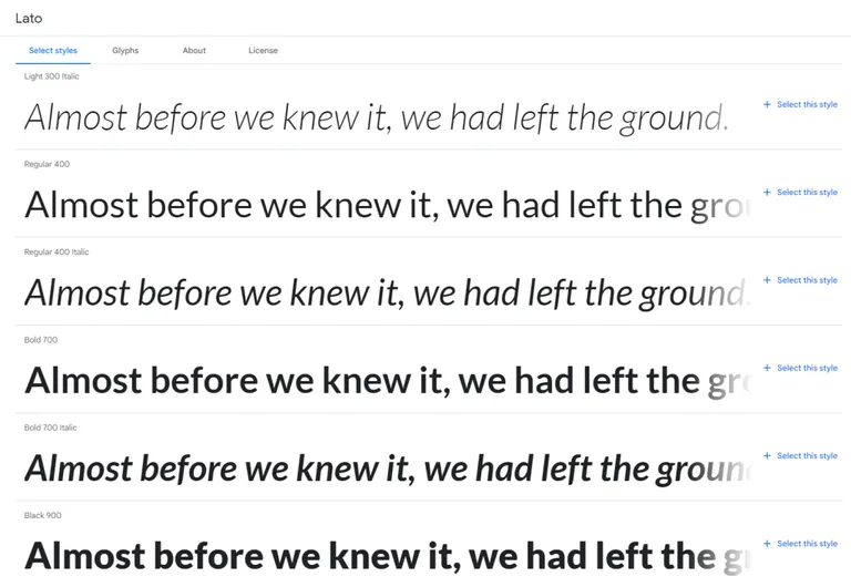
Lato looks great when you can see more of it, which is why designers primarily use it for headers and less so on body content.
It pairs great with fonts like:
- Merriweather
- Abril Fatface
- Francois One
- Karla
- Roboto
- Open Sans
7. Playfair Display
The Playfair Display font is a rather unique one with its high-contrast and delicate hairlines.
The design would probably take you back to the mid to late 18th century as it was influenced by typefaces during that era (though the actual design was only made in 2011).
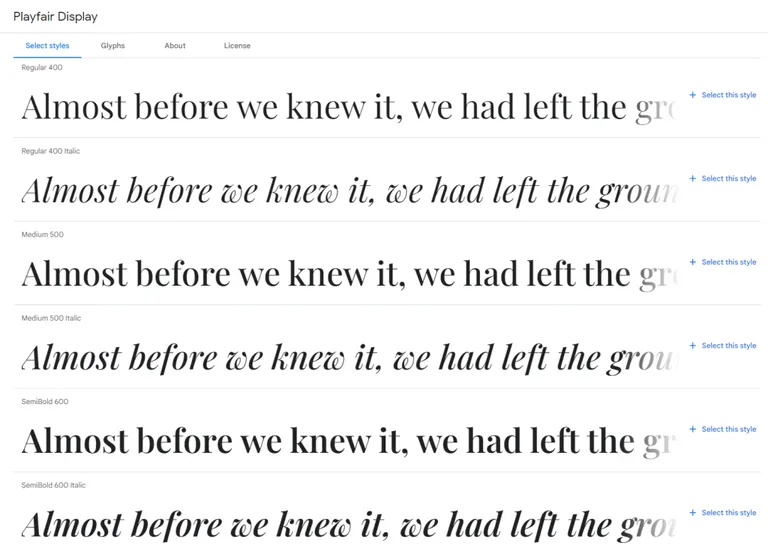
The “Display” word signifies that it’s large by design. Because of this, Playfair Display works best when used in titles and headers.
It pairs great with fonts like:
- Open Sans
- Roboto
- Lato
- Montserrat
- Poppins
- Georgia
So which font do you like the most? Or do you have some other font you think would look best on websites? Let us know in the comments below.